This is a tutorial on how to create heatmap data visualizations using R and Facebook Marketing API as a data source. You will learn how to create Hourly spending data by day heatmap in this tutorial.
Facebook Ads Manager has an hourly visualization like this:
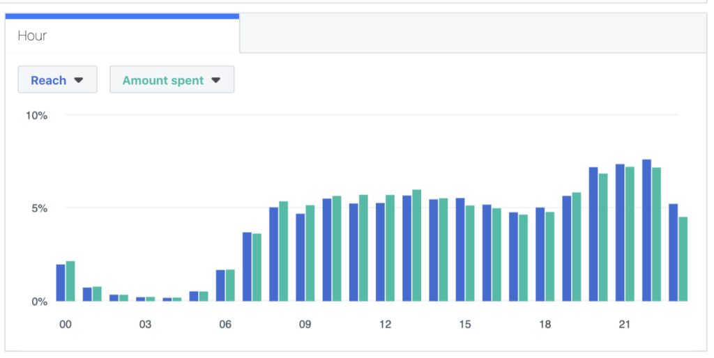
It works pretty well except when you have to analyze any anomalies with your daily and hourly budget allocations. I had a case when Facebook Ads delivery system redistributed spendings in favor of hours with lower CPM. The action made my activities less efficient and the analysis provided below helped me to clarify the reason for my bad results.
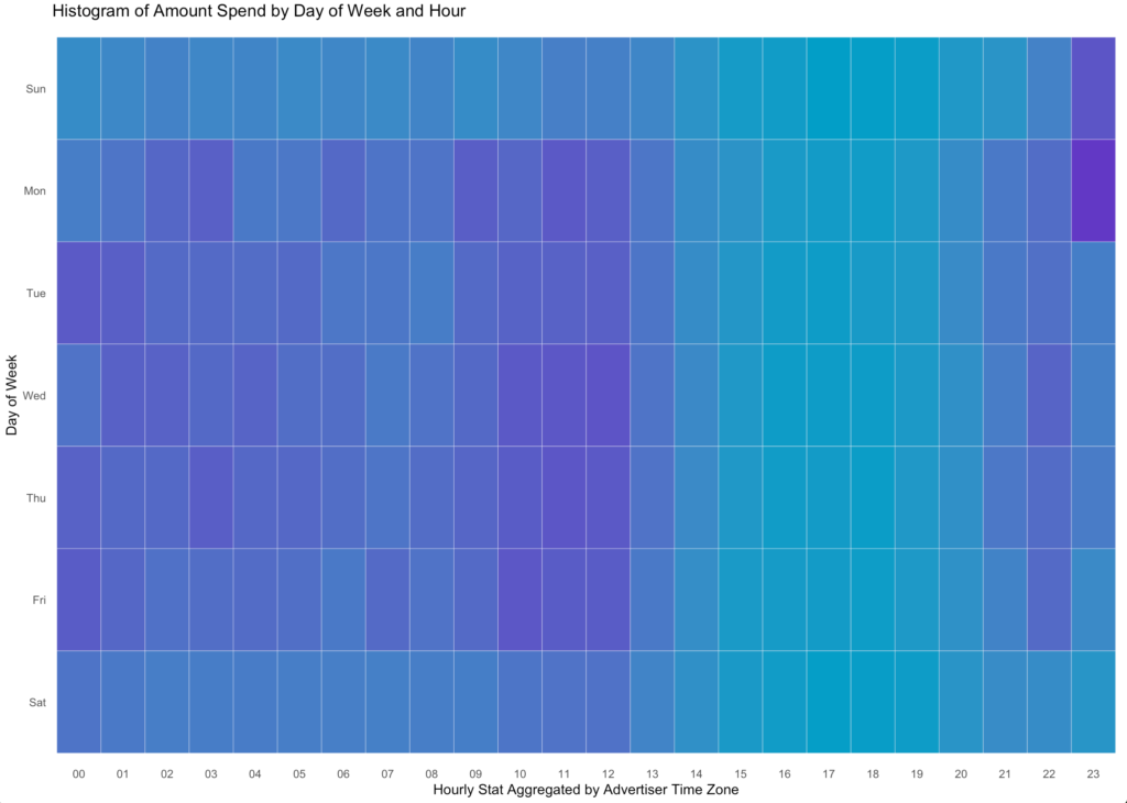
The new visualization has a two-dimensional presentation. The new graph opens new frontiers of understanding our daily spendings and customers’ behaviors.
It’s clear that the account weekdays are our key focus, spendings are much less during weekends. 10 am – 12 pm are the rush hours.
There are two anomalies at the top right corner. We spend more than usual on Sunday and Monday after 2300 . It usually takes place when the budget is higher than needed and the Facebook Ads delivery system is in a hurry to spend the daily budget till the end of the day. It is a sign to decrease daily budget or make a targeting audience bigger.
The graph intends to show such anomalies for further analysis in Facebook Ads Manager.
Preparation
For this project, I required two different sets of packages. The first would be for making API calls and cleaning my data so that I can have data.frame data structures. The second set of packages is for the visualization: ggplot2.
Before running the code below, you have to create a Facebook App to use Facebook Marketing API and establish a connection with fbRads package. The detailed instructions you can find here.
#Load required libraries

library(httr)

library(fbRads)z

library(gargle)

library(jsonlite)

library(lubridate)

library(ggplot2)


#Run authentification to get the token.
#The code running only once, so you don't have to store parameters into variables.
app <- oauth_app('facebook', 'App ID', 'App Secret')
Sys.setenv('HTTR_SERVER_PORT' = '1410/')
tkn <- oauth2.0_token(oauth_endpoints('facebook'), app, scope = 'business_management',
                      type = 'application/x-www-form-urlencoded', cache = FALSE)
tkn <- jsonlite::fromJSON(names(tkn$credentials))$access_token


#This will create a .rds file under your working directory.
saveRDS(tkn, 'token.rds')

#Run the function below to list all your ads along with the ad name and status.
#This is mainly for testing purposes.

fbad_list_ad(fields = c('name', 'effective_status'))
After installing and loading the packages, you can load your raw data.
The code below runs to establish a connection and make API calls and get spending data from Facebook Marketing API by insights_data() function of the fbRads package.
#Assign color variables
col1 = "#029EC7"
col2 = "#6238C5"

startdate = "2018-04-01" #set your start and end date.
enddate= "2018-06-30" #The longer periof the longer API responce would be.

insights_data<-fb_insights(time_range = paste0("{'since':'",startdate,"','until':'",enddate,"'}"),

            level = 'account',time_increment=1,
            fields = toJSON(c('spend')),
            breakdowns = 'hourly_stats_aggregated_by_advertiser_time_zone')
The result is a list and has to be transformed into data.frame to be visualized. The easiest way I know to do that is rbind.data.frame() function.
#Transformint a resulted list into a data.frame.
df <- do.call(rbind.data.frame, insights_data) #convert a list into a data.frame

#Change the collumn format.
df$spend<-as.numeric(df$spend)

#Add new collumns which are used for the visualisation.
df$wday<-wday(df$date_start, label = TRUE)
df$hour <- substr(df$hourly_stats_aggregated_by_advertiser_time_zone, 1, 2)

#Creating the final table with the only data needed for your graph
#Summarise the spending the spendings. This is another way of making a pivot table.

dayHour <- ddply(df, c( "hour", "wday"), summarise,
                 N    = sum(spend))

#reverse order of months for easier graphing
dayHour$wday <- factor(dayHour$wday, levels=rev(levels(dayHour$wday)))
attach(dayHour)
Now that I have these data structures, I need to complete the visualization. There are lines of code where you can customize your graph, and I will call them out in the final section of this blog post.
#Run ggplot() function to make the heatmap ready.
ggplot(dayHour, aes(hour, wday)) + geom_tile(aes(fill = N),
				colour = "white", na.rm = TRUE) +
  scale_fill_gradient(low = col1, high = col2) +
  theme_bw() + theme_minimal() + theme(legend.position="none")+
  labs(title = "Histogram of Amount Spend by Day of Week and Hour",
       x = "Hourly Stat Aggregated by Advertiser Time Zone", y = "Day of Week") +
  theme(panel.grid.major = element_blank(), panel.grid.minor = element_blank())
The provided code above generates the next plot for my data.
Lastly, I want to highlight the most important conclusion I did. Data visualization involves trial-and-error for what I think looks best and shows some meaningful data story. The following lines of code are results of my daily routine as a Facebook advertising specialist and this helps me to get answers for my practical questions.