The first time I was asked to create a landing page for a software product I had no clue what the page has to look like.
Three years passed before I gained some confidence at launching something. During that time, I studied every website I could find and worked hard on building one that would make selling as easy as possible. The first thing I started with an analysis of competitors.
In this post, I’m going to share my observations and ideas that were found on our competitors’ websites during the last three years.
In our project, we constantly change our landing pages and create additional pages for our products to maximize ROI.
However, it is not always clear what I have to change, and what kind of A/B test I have to run. That is why I always keep my eyes on competitors. And I will provide the analysis of their pages below. For the analysis, I take 20 landing pages of our direct competitors.
A couple of words about our company. We produce desktop photo editing software for Mac and PC. It’s important — a desktop software product for photographers.
In our business, a landing page is probably the most important part of the website or particular marketing activity. Usually, there are up to 5 key elements that make it work. I used to think about a landing as a blank canvas so putting some elements on it have to attract visitors.
First of all, a landing page must drive interest, inspire and explain what a product is about. Furthermore, there are some other things it has to do:
- Encourage desire to use the product.
- Show key features and differences.
- Provide enough information for visitors.
Everything has to be done in a very short period of time.
Unfortunately, there is no magic wand to craft a perfect landing page. But my goal is to highlight and test a specific set of elements, which are constantly used by the majority of competitors. I hope the analysis and my findings inspire you to try something new on your websites.
First step: Preparing a list of competitors.
The list is ranked by Alexa index:
- Apple Photos
- Adobe Lightroom
- Pixlr
- Movavi
- Fotor
- Picmonkey
- Affinity
- InPixio
- AuroraHDR
- ACDsee
- DxO PhotoLab
- On1 Photo Raw
- Topaz
- Polarr
- Portrait Pro
- Pixelmator
- Capture One
- AfterShot Pro
- Lensball
- Landscape Pro
Second step: Setting key elements to explore.
The factors that are described below are important for my particular case and may not be the same for your tasks. In any case, everyone needs proofs on daily disputes with colleagues.
The list of elements:
Title, Description, Call-to-action on the first screen, Free Trial, Register to get a Free trial, Price on a page, Product advantages, Features list, Interactive elements, Video, Screenshots, Before-after photos, Header, Fixed header, Footer, Any social proofs, Customers’ feedback, Awards.
The final table looks like that:

Third step: Analyzing each element.
With the help of collected information, let’s determine how often each particular element is used.
There are several interesting statistical facts:
75% — contain a title
60% — contain description after a title
85% — contain a call-to-action on the first screen
80% — contain Free Trial
35% — let users download trial only after entering an email
45% — show the product price
85% — contain product advantages
70% — show a Feature list
Multimedia
40% — contain video
85% — contain screenshots
85% — contain Before-after photos
Headers and footers
90% — contain header
55% — contain a fixed header, which stays on the screen while scrolling
80% — contain a footer
Social proofs
35% — contain some form of social proofs
20% — contain reviews
15% — contain awards
What do these numbers tell us?
I don’t have specific conversion rates for any of the pages, so I can’t define which element works (statistically). However, the goal of this analysis is to define the list of ideas. This information is more than enough to accomplish that.
So, here are my key findings:
Title: way to stand out.
Short and memorable title forms visitors’ expectations. It must emphasize product advantages and differentiate a product from competitors.
Testing ideas:
- Test of new titles
- Add or change the description after a slogan
Here are some competitors’ examples:


Practically, I was not able to statistically prove the impact on a conversion rate of a title. The factor is certainly important, but changing it slightly, the impact can’t be revealed, and I am afraid to make radical changes.
Free Trial: Determine a model.
A free trial button dramatically reduces sales conversion rate for people who are familiar with the product. At the same time, the lack of a button makes it impossible to acquire new customers.
Finding the compromise is a big deal not only for the landing page optimization but for the product in a general. The majority of competitors uses the trial model on their pages, which forms customer habits. It is difficult to convince to buy a software product without giving a try.
Testing ideas:
- Test the number of buttons.
- Test Call-to-action “Try Free” vs “Download Now”.
- Clarify buttons priority: Try vs Buy.
- Test a registration form before giving a trial.
- Test different buttons for each traffic channel.
Here are some competitors’ examples:


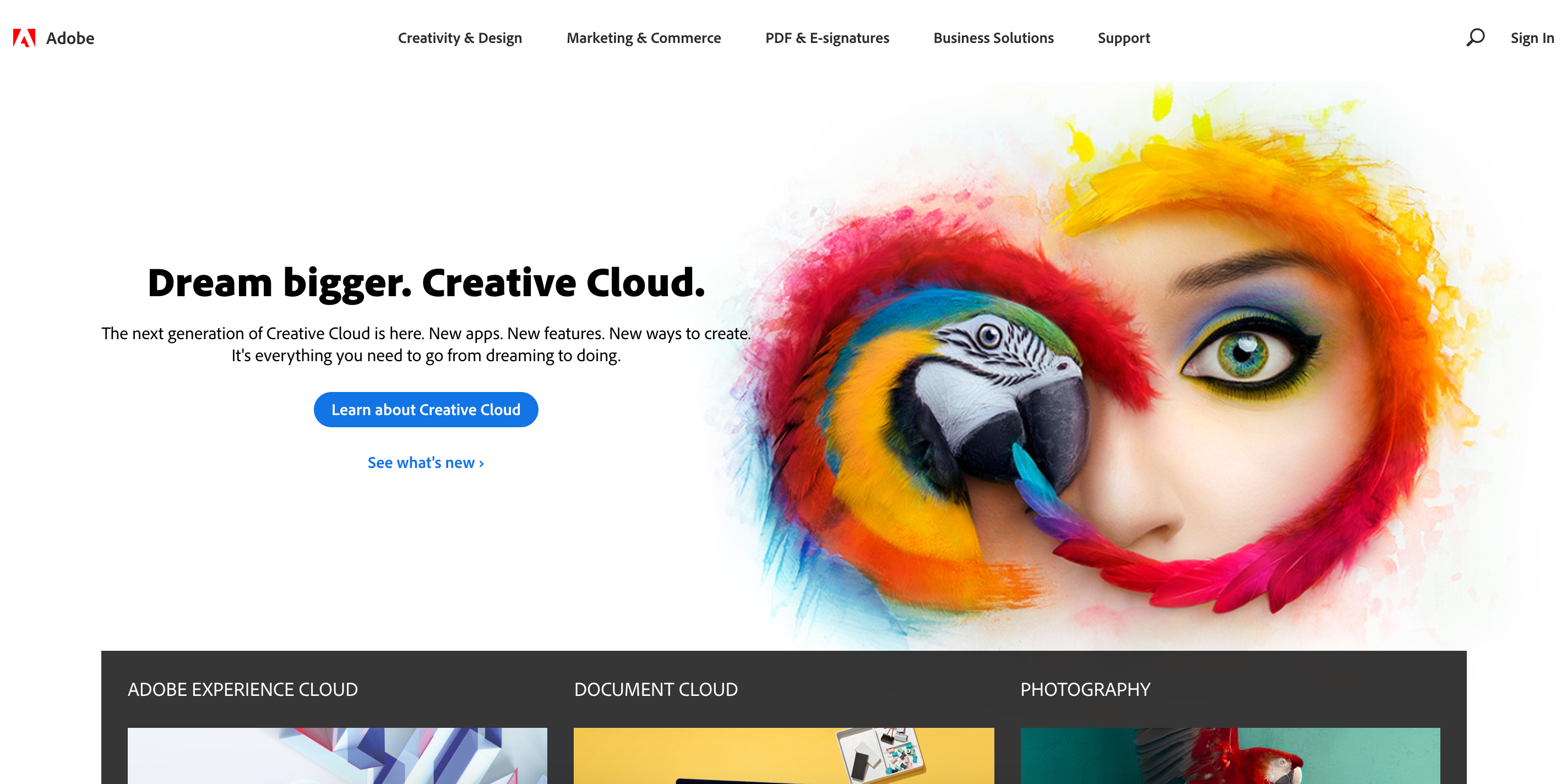
These tests are endless, but the optimal model can exist: create two separate landing pages for new visitors and for visitors who are familiar with the product. Based on my findings, new visitors get a trial and the others react to the “Buy now” button.
Adobe works this way. Their home page changes when the visitor is logged in:

Call-to-action: Engage visitors on the first screen.
Almost all our competitors (85%) pages contain a call-to-action on the first screen, that can seriously affect a conversion rate. It is definitely worth testing.
Testing ideas:
- Test new phrases for calls-to-action — try the word “Download”
- Try different colors and formats.
- Test interactive elements that show product features on the first screen.
Here are some competitors’ examples:


My tests showed that pages with a single Call-to-action work better than pages with multiple buttons, for example: “Buy” and “Try now” simultaneously.
Features: Explain how the product works.
70% of competitors show a detailed list of their products’ features. The exception is Adobe Lightroom, which doesn’t need an explanation. Before your product is so popular and most visitors already know how it works, you need to explain your product features.
There are many different ways to explain what the product is about: screenshots, videos, interactive elements and more.
Testing ideas:
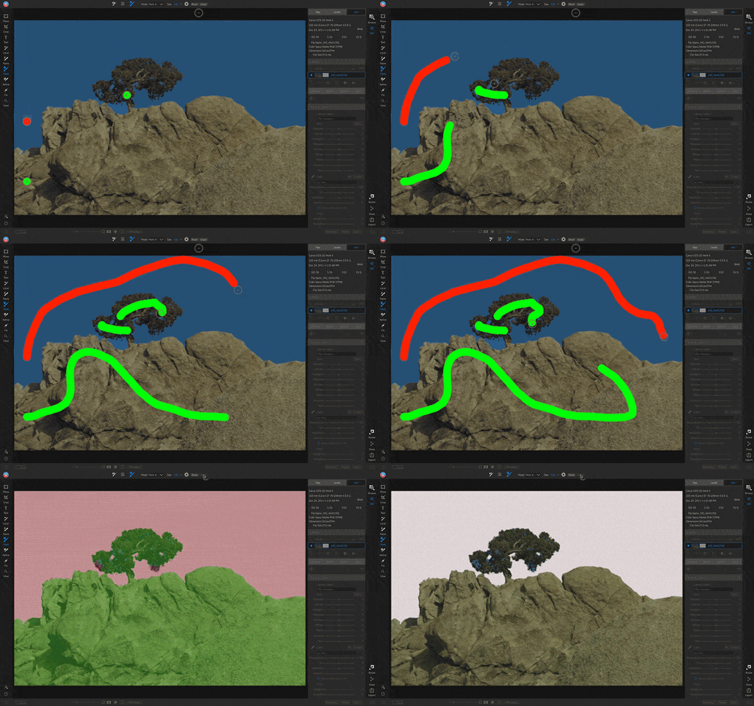
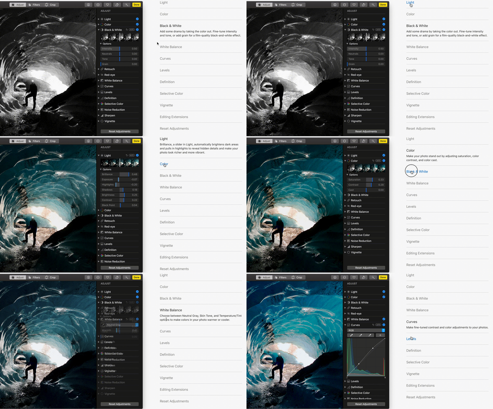
- Explain what the product does with screenshots. The audience is visuals, so every graphic element is important.
- Video can give additional competitive advantage.
- Test “Before / After” elements, that show the photo editor capabilities for an inexperienced audience.
- Show the product interface as early as possible.
Here are some competitors’ examples:




Social proofs: Determine the importance.
Surprisingly, most pages (65%) do not use any form of social proofs.
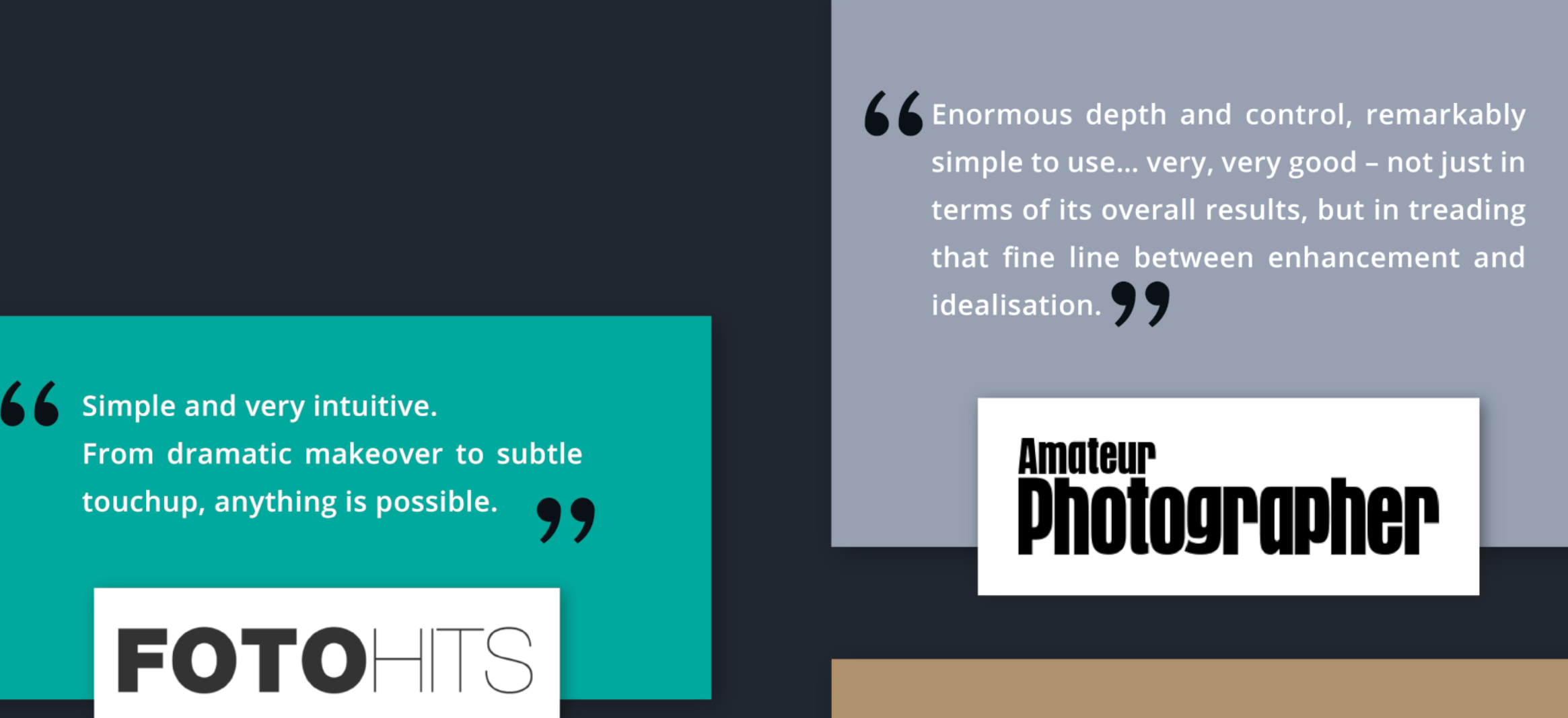
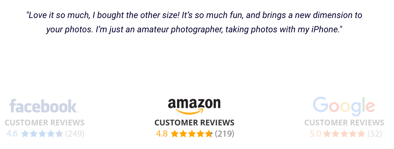
It is important to test the impact of reviews, awards, ratings and other forms of social proofs. This can be a great way to differentiate from competitors as a customer oriented company.
Testing ideas:
- Add a list of customers’ reviews.
- Collect feature suggestions and requests.
- Show Trustpilot ratings as early as possible.
- Show brand Ambassadors.
Here are some competitors’ examples:


It is important to remember that the idea that works for me may not be appropriate for your goals. Moreover, different types of traffic, optimization methods will show different results. This is only the list of ideas, which deserve have to be tested. And so the final list is:
I hope my analysis inspires you to make some improvements to your websites. Before making any changes, analyze your current behavior data to make a meaningful comparison with future changes.
